Android UI Layout, Style and Theme
Android development is both rewarding and challenging. To dive into this field, you’ll need to grasp various concepts, including UI layout and its components like styling and themes.
Jetpack Compose is Android’s recommended modern toolkit for building native UI with less code, powerful tools, and intuitive Kotlin APIs. It simplifies and accelerates UI development. On the other hand, views-based workflow is the old way of developing android UI which involves creating XML files to describe your UI.
Layout
Layout in Android defines the structure of a user interface for your app. The two built-in blocks of android layout are View and ViewGroup.
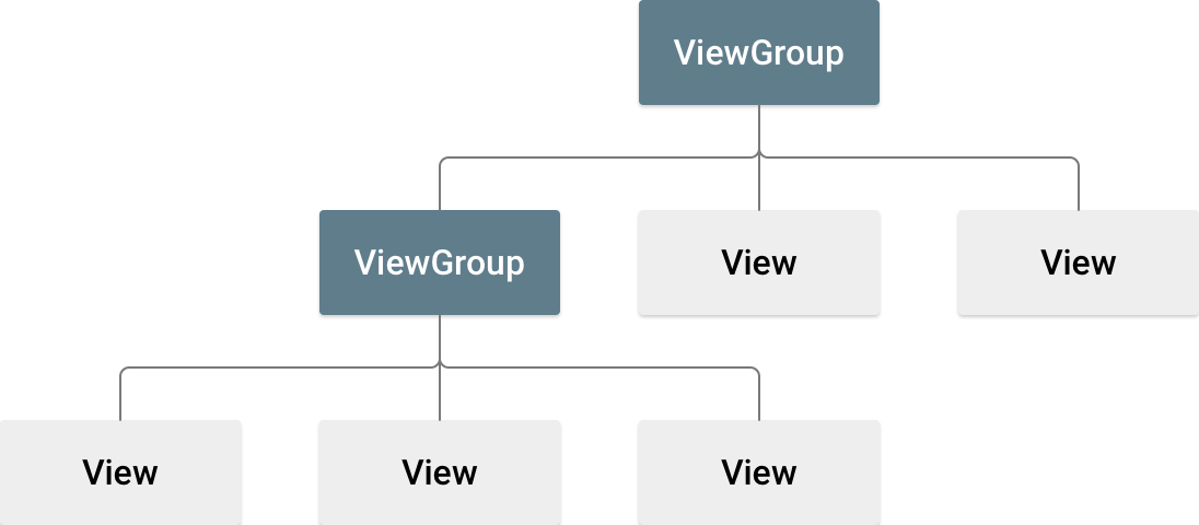
View objects are specific UI elements like Button or TextView. The ViewGroup are Layout subclasses like LinearLayout or ConstraintLayout.
A UI Layout in Android can defined statically using XML markup language or at runtime via code. You can also have mixed of both approaches.
Each XML file should only contain one root element, after that you can add nested layouts into your root element. An example of XML Layout that has a LinearLayout root.
<?xml version="1.0" encoding="utf-8"?>
<LinearLayout xmlns:android="http://schemas.android.com/apk/res/android"
              android:layout_width="match_parent"
              android:layout_height="match_parent"
              android:orientation="vertical" >
    <TextView android:id="@+id/text"
              android:layout_width="wrap_content"
              android:layout_height="wrap_content"
              android:text="Hello, I am a TextView" />
    <Button android:id="@+id/button"
            android:layout_width="wrap_content"
            android:layout_height="wrap_content"
            android:text="Hello, I am a Button" />
</LinearLayout>
This is a vertical layout that holds two UI components: A text view and a button. A UI components is similar to an HTML element and contains various attributes. Some of the attributes are:
- android:id: A unique resource name for the UI element.
- android:layout_height: This is a mandatory attribute and it descrbies the height for the UI element.
- android:layout_width: Again mandatory and describes the width of the UI component.
- android:orientation: specify the direction in which child views are placed within a parent container. It can be vertical or horizontal.
- android:gravity: specifies how the child views are positioned relative to each other within the container.
- android:tag: Tags are essentially an extra piece of information that a view can have. You can use a same tag for multiple view and use that tag to retreive them.
- android:theme: Specifies a theme override for a view. When a theme override is set, the view will be inflated using a Context themed with the specified resource. During XML inflation, any child views under the view with a theme override will inherit the themed context.
What is the R class?
R is a class containing the definitions for all resources of a particular application package. It is in the namespace of the application package. Android R.java is an auto-generated file by AAPT (Android Asset Packaging Tool).
You can find the generated classes which compiled into R.jar file in your app/build folder:

R class is the gateway to access all types of resources via static fields. If you decompile the R.jar file and check out a typical R.class, you’ll see something like this:
public final class R {
    private R() {
    }

    public static final class id {
        public static int FirstFragment;
        public static int SecondFragment;
        public static int action_FirstFragment_to_SecondFragment;
        public static int action_SecondFragment_to_FirstFragment;
        public static int action_settings;
        public static int button_first;
        public static int button_second;
        public static int fab;
        public static int nav_graph;
        public static int nav_host_fragment_content_main;
        public static int textview_first;
        public static int textview_second;
        public static int toolbar;

        private id() {
        }
    }
}
As you see id is the inner class that includes all the defined id resources as static fields.
When you change the XML layout in Android, the R.class will be auto regenerates which enables you to access those new added resources in your runtime code. for example in java, you can access a defined button via this code:
Button button = (Button)findViewById(R.id.button_first);Style
In the Android world, Style is similar to CSS in Web Design. You use style to give look and feel to your application user interfacce. A style is a set of visual characteristics that defines how a View looks. These characteristics can include font color, font size, background color, and other elements.
A style content is in xml langugage and it looks like this:
<?xml version="1.0" encoding="utf-8"?>
<resources>
    <style name="GreenText" parent="TextAppearance.AppCompat">
        <item name="android:textColor">#00FF00</item>
    </style>
</resources>
The style name can be used to reference in your view layout. You can also have inheritence with styles. The parent attribute could reference Android style templates or other libraries. By declaring parent, all the collection of attributes inside it will be drag into the defined style. You can then override items or add more to them.
Theme vs Style
Themes and styles share similarities but serve distinct purposes. Both have a basic structure based on key-value pairs, where attributes are mapped to resources.
A style defines the attributes for a specific type of view. For instance, a style can specify the properties of a button. Any attribute you include in a style is something you can also set directly in a layout file. By consolidating these attributes into a style, it becomes easier to reuse and maintain them across multiple widgets.
On the other hand, a theme represents a collection of named resources that can be utilized by styles, layouts, widgets, and more. Themes assign meaningful names to resources, such as colorPrimary, making them accessible throughout the app.
Styles and themes are designed to complement each other. For example, a style might specify that one part of a button uses colorPrimary and another uses colorSecondary. The actual color values for these names are defined in the theme. When the device switches to night mode, the app can transition from a “light” theme to a “dark” theme, dynamically updating these resource values. Since the styles rely on semantic resource names rather than fixed color values, they do not require any changes.